Kernmantle Group
Business Card

Presentation

The Challenge
Developing a logo and brand identity for a consulting company that does economic research, education, training, and speaking, specifically for commodity markets.
My Solution
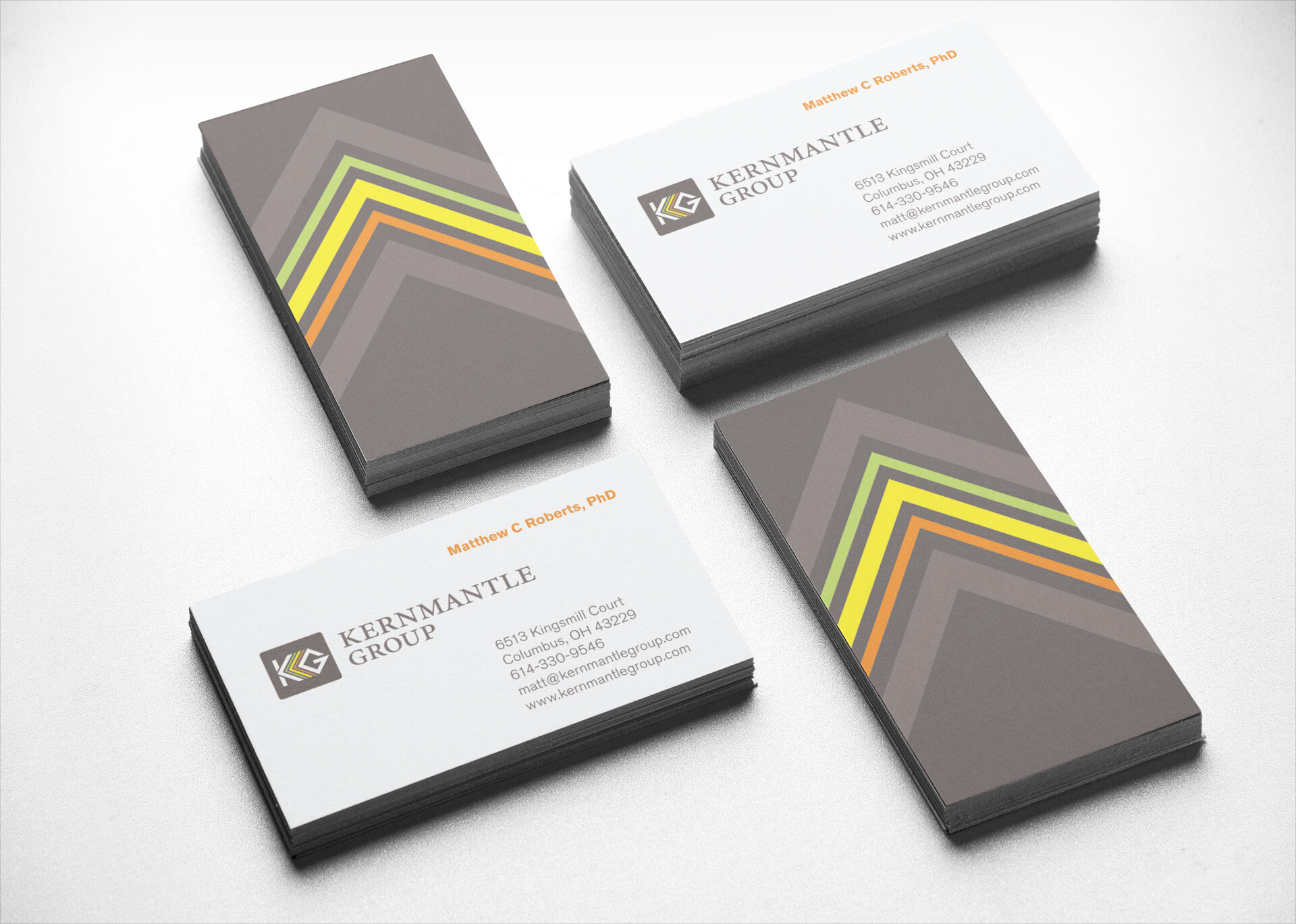
The name “Kernmantle” comes from the name of a rope construction specially designed for strength, durability, and flexibility. I wanted to capitalize on that connection and used the “K” and “G” to create the outer sheath of the rope with the inner lines representing the inner core of smaller ropes. Working with the client’s requirement of incorporating green, yellow, and orange, created a challenge since those colors are bright and can be distracting. I built those into the inner “ropes,” then included an elegant gray background to subdue the colors and create a more serious, professional look.